|
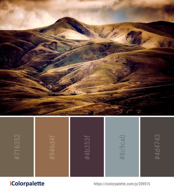
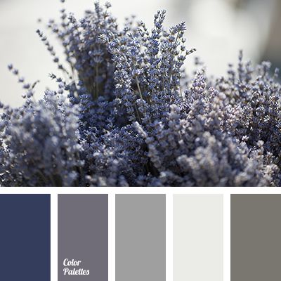
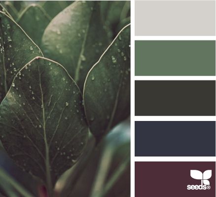
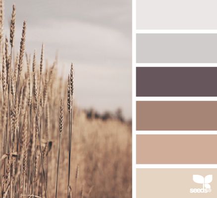
Depending on what you you intend to do in this room will change the colour choice slightly. The general ‘rules’ are: Pinks are lively, fun. Reds are passionate, daring and intimate Oranges are warming, cozy and stimulate creativity Yellows are sunny and welcoming Red Violets - stimulating So, generally speaking. These are the colours that should be avoided. While choosing colours like Greens - nature, restful, balancing Blue - sky, water, clear thinking Blue violets - cooling, spiritual Can provide that calming feeling. However, these are just general terms. Depending on the orientation of the room, the time the room is used and what the purpose of the room is will impact of what colours suit best and give the correct calming effect you are looking for. Some prefer a darker room to relax in, with little to no natural sun light. They want to feel secure, safe, cozy and warm. In these cases deep maroon can work, especially when balanced with deep greens. Whereas using dark blue may have the opposite effect and, while being calming, can actually make you feel quite cold. So look at the colour tones and shade rather than just red, blue, green etc. For others, they might prefer to relax in a lighter room, full of natural light. In those cases I would steer you towards more earthy tones. Keeping it light without distinctive colours. For this look at colour tints. Have a look at the colour palettes I have added below and see what might work for the space you are looking to use.
0 Comments
Leave a Reply. |
AnneriekeInterior tips and tricks. Archives
August 2020
Categories |
 RSS Feed
