|
Red in general is a real uplifting, lively colour. by nature the colour stimulates senses thus it is not a relaxing colour. Depending on what kind of vibe you are looking to create in the bedroom I would use red paint in a sparing way. For instance as a feature wall. It can definitely work if you really want to use red. 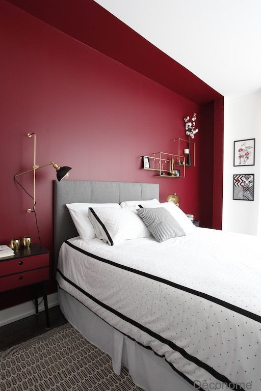 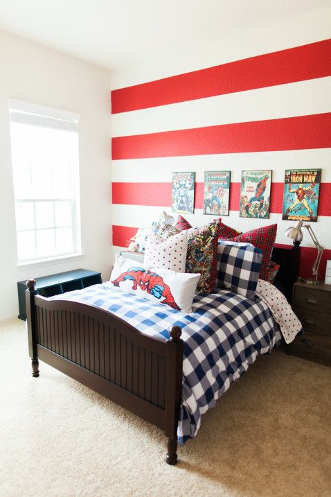 For the most part I would stay away from using too much red in a bedroom for the simple reason that this is the space you want to relax in and get a good nights sleep. To create this feeling I would look at using blues, greens, neutrals and (certain) purples. These colours surround you with calmness, coziness and you will be able to relax easier with these colours. 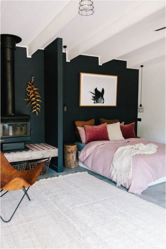 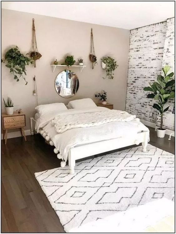 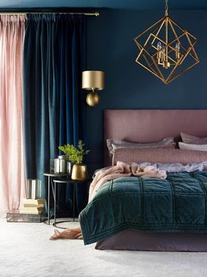 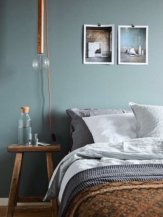 These are just a few examples of a calmer decor. All images from Pinterest.com
0 Comments
Both grey and blue categorise as cold colours and can also both be seen as neutral colours. If this is the look you are going for and want to continue with this vibe here are some ideas. Tans, browns, and other neutrals bring a little interest while keeping within the relaxed, muted tones. 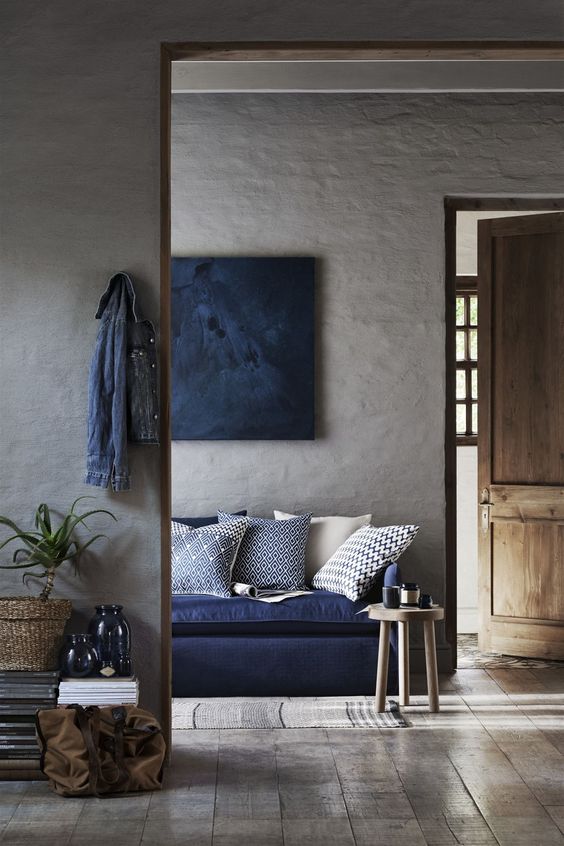 moss and darker greens are great as well. They add a new, warmer colour while again, keeping within the vibe. 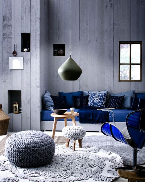 Now, if you’d like to introduce a more vibrant and perhaps eye catching colour look at options like pinks, purples, vibrant greens and yellows. They can transform the space immediately. 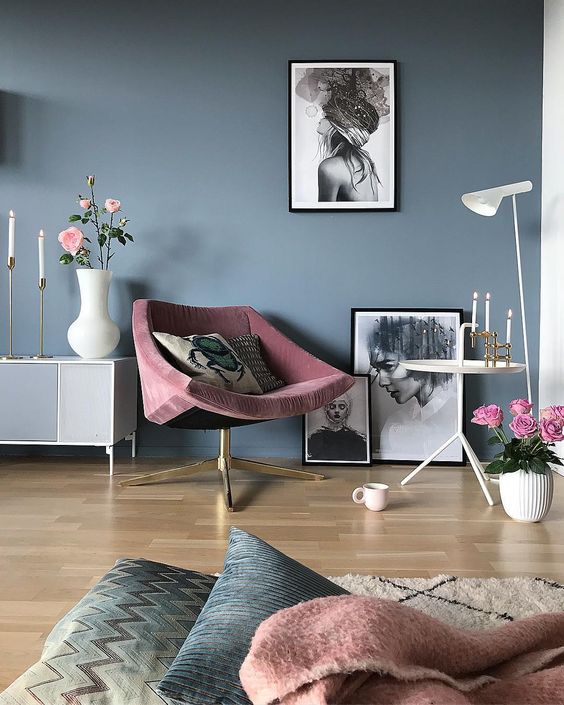  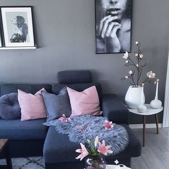 These are all solid colours suggested, however adding pattern to a room is also a great way to add interest without necessarily introducing one or any colour at all. Adding several colours and layering that with pattern is also a great way to accent the grey and blue already present withing the space. All images from pinterest.com
When using gold and brown in interiors I would suggest looking at complementary colours that lighten the overall feel. Brown can be quite a heavy colour to use in interiors so finding a colour that offsets that can help define and brighten the room. Using colours like beige, cream, orange and most greys can make the overall decor look quite dark and tiring when combining with brown. 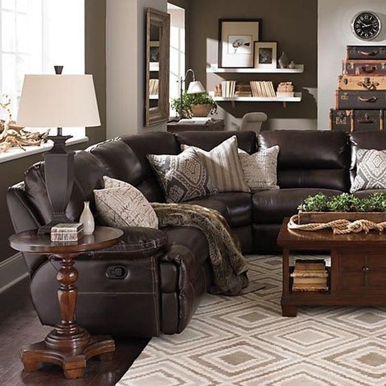 However there are lots of colours that look amazing when combined with brown and gold, allowing all colours to shine on their own. For instance, pink in a great colour to use with brown as it breaks the harshness of the brown adding a little sweetness to it. 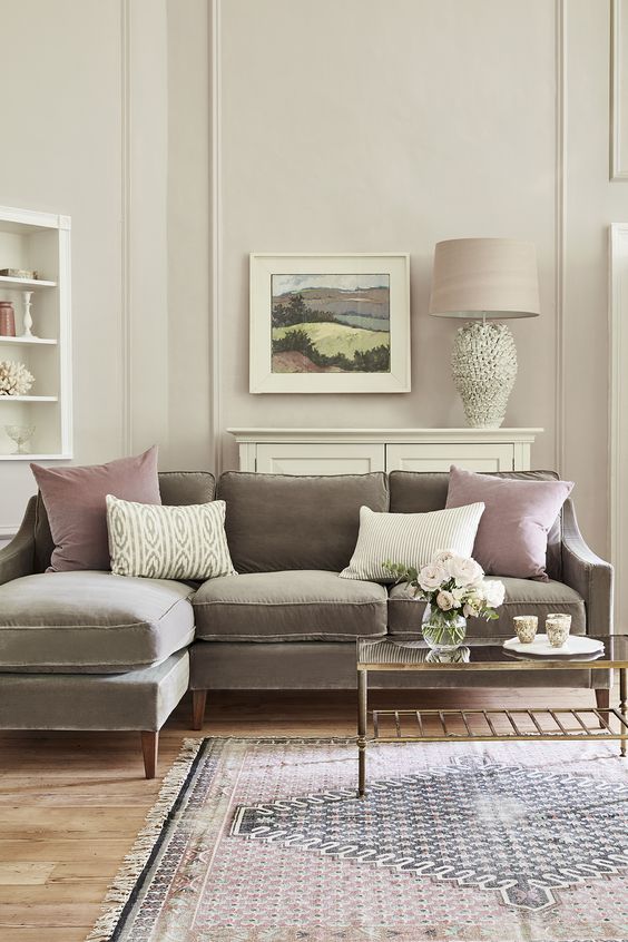 Combining brown and gold with white makes a lovely crisp and stylish look. It gives a space sophistication while allowing room for you to add personal elements.  As brown is a nuetral, natural colour it always works well with greens. Bringing that outdoorsy, natural feel into the home. 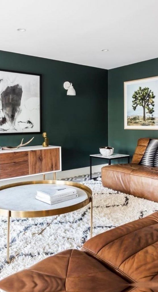 Brown and gold are both warm colours, so balancing that with a cooler colour like blue can give a room great interest and create a perfect space to be in.  These are only a few ideas of course and there are many more combinations possible. Brown is both an easy and tricky colour to match depending on the feel you are trying to create. The colour itself goes with almost everything, being a neutral colour. However combining the colour with other neutrals can make a space feel just that, neutral and lacking depth. Combining it with colours like pink, green or blue takes the brown away from its neutral status and gives it a place to stand as it’s own feature colour. All images from Pinterest.com
|
AnneriekeInterior tips and tricks. Archives
August 2020
Categories |
 RSS Feed
