|
A bedroom is the place you want to relax in at the end of the day. A space that feels both welcoming and relaxing. Choosing the right way to decorate this in a way for you to find restful can be a challenge. So keeping a few simple guidelines can be quite helpful. The different colours are divided in several categories to help find the most suitable ones for each project. Relaxing and calming colours include: blue, green, neutrals and greys Lively colours include, yellow, red and orange. Now, these are only guidelines, it doesn’t mean you have to keep to these. However it does show which category might work best when wanting to add colour to a project. So is orange a good colour for a bedroom? Well, using orange as an accent colour within a bedroom does work. Using it as the main colour for walls, furnishings ect might be too overwhelming and you may find it hard to relax in such a space. 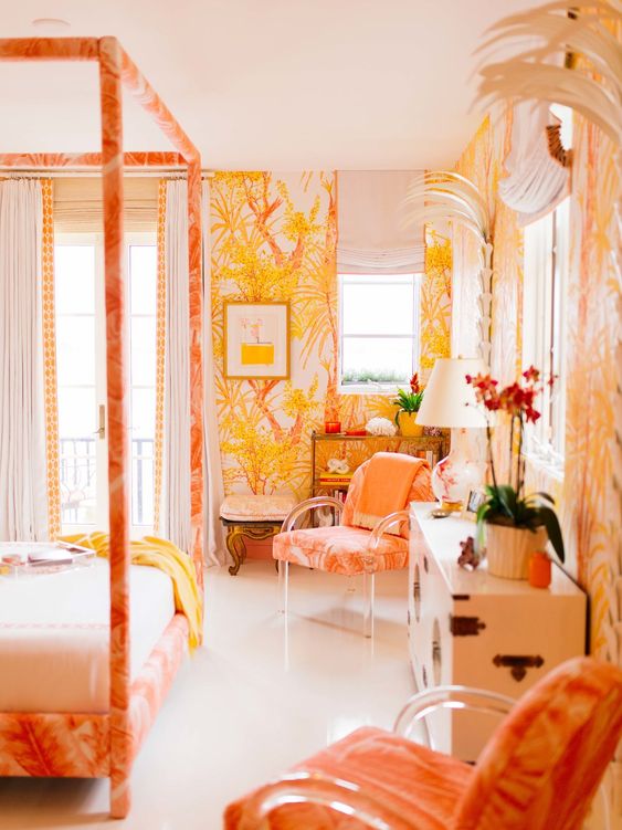 That said orange is a very warming colour, so adding hints of this to a relaxing atmosphere can add that little bit of interest and coziness. Orange works very well with teals, blues and greens, so adding little elements to a more neutral background can provide that little fun and freshness while keeping the overall feeling calm and tranquil. 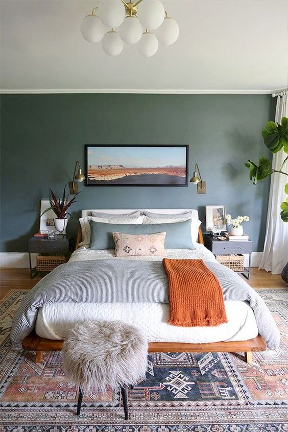 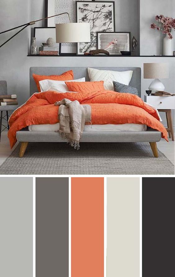 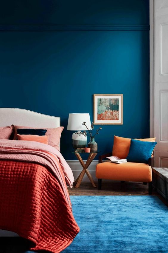 All images from Pinterest.com
0 Comments
Coral can be quite a tricky colour to match to your interior as it really stands on its own. However it is not impossible. If you have a piece of furniture in coral you might be looking to highlight it in someway, and why not?! So how to go about this. Placing a white or off-white wall behind the coral allows the colour to shine and be the center piece in the room. 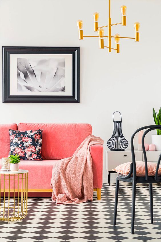 It frames the colour beautifully and supports its vibrant nature. It keeps the look fresh, new and crisp. Off-whites with a hint of grey or blue make sure the edges don’t blend and frame the furniture just right. While off-whites with a hint of yellow or pink blend in with the coral thus fading the edges between wall and furniture. 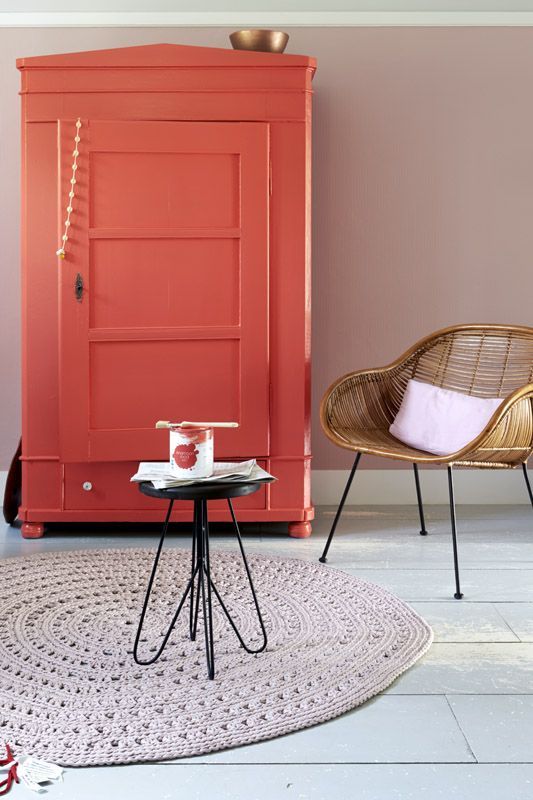 Pairing the coral with a darker back ground also gives an amazing effect. Rather that bringing the crispness out it surrounds the coral lovely. The dark walls hug the coral, highlighting the warmth of the colour, bringing out the coziness. 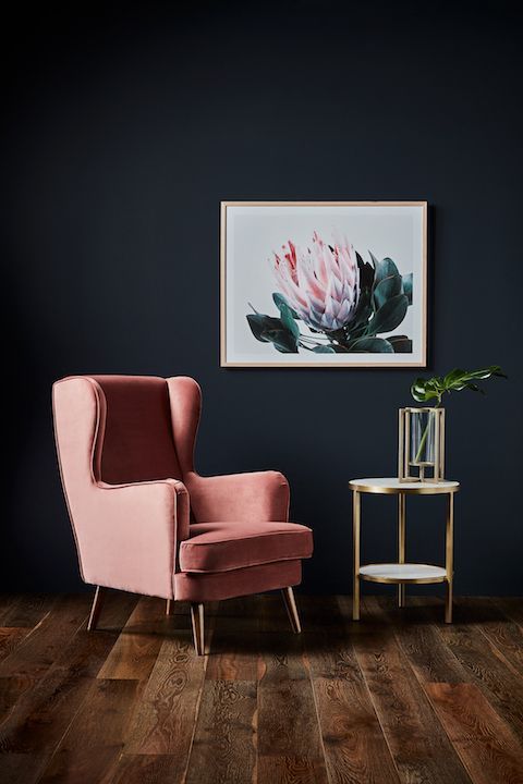 Think of dark blues, greens and greys. Again, these colours frame the coral without blending with the furniture, keeping the outlines clean. 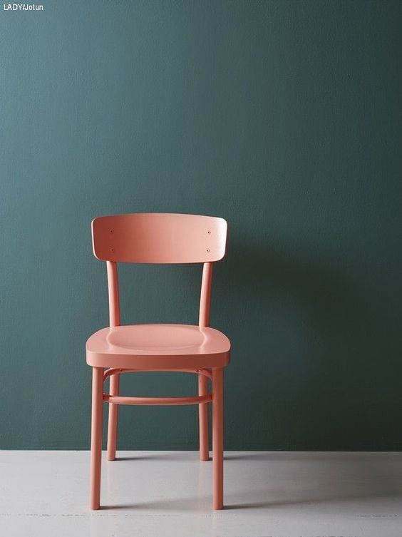 The same goes for accent walls. Using coral as an accent or feature 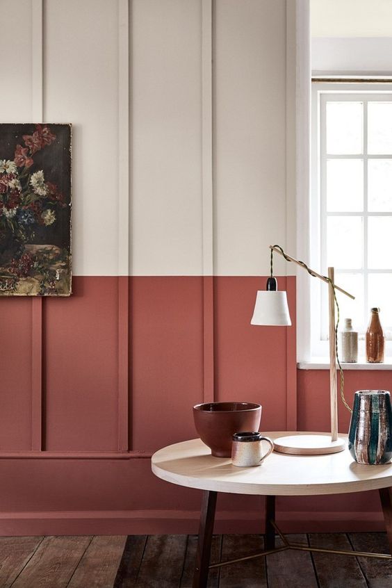 And pairing it with pastels, especially on walls, create a beautiful and versatile background. 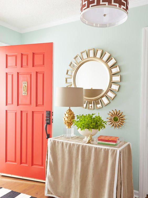 All images from Pinterest.com
Grey is very much a neutral colour, which is great as it opens up pretty much endless possibilities for accents colours, textures, patterns and other furnishings. When starting with grey as your base colour think of where you would like the final look to go as this will influence the further colour choices you make. For a calming, neutral finished look add colours of the same value yet different tones. Sticking to other neutrals will create a cohesive, relaxing environment. Think of other greys, browns, off-whites, beiges, etc. Adding some natural elements like a wooden coffee table of shelves will look amazing in a space like this. Though mixing different colours would be advisable as keeping all elements in the room grey can make the space look quite bland, adding other neutrals bring life and depth to the space.  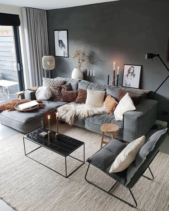 That said. Grey as a base also allows you to go bold and choose vibrant, popping colours to add a funky, interesting and playful edge to an interior. Think of dark grey walls with a big neon art piece. Grey walls and floors with a bright orange accent chair. Neon signage, lime green rugs, pink velvet sofas. The possibilities are endless and so fun when taking a little leap and going for that unexpected item. Grey can give a very sophisticated look, which makes it all the more fun to break that up with something unexpected. Keep that sophisticated look but add funk, add fun, add that unexpected edge and let it shine! 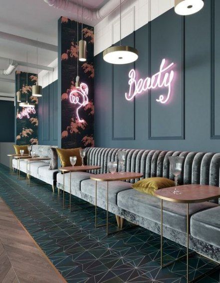 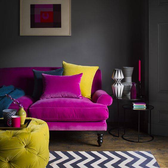 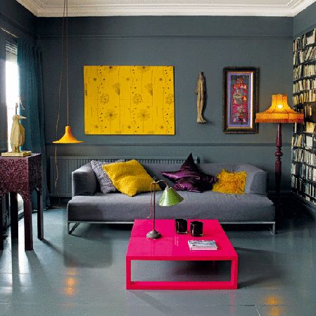 Grey gives you an incredible chance to go bold, to try something new and unexpected. Go for it! All images from Pinterest.com
In general the bedroom in the room in the house you want to go to to relax and get a good night sleep. Calming colours, like green, therefore work very well in such spaces. Although green is categorized as a ‘cool’ colour choosing the right shade of green can certainly add a warm sense as well. Depending on the mood you are ultimately trying to set in the bedroom there are several ideas available. If you are looking to add a little zest and fun to the space then choosing a bright, perhaps neon, shade might be the way to go. Its fresh, paired with the correct accessories it can be a quite clean and fun space. 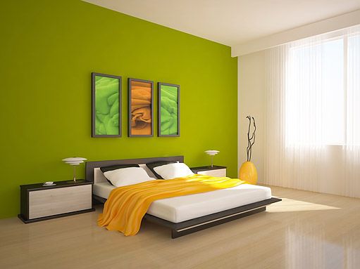 If it’s a more tones down, calming, zen kind of vibe you’d prefer then look at sage, moss, darker shades, green with a grey undertone. It provides the calming, comfortable feel and looks great. 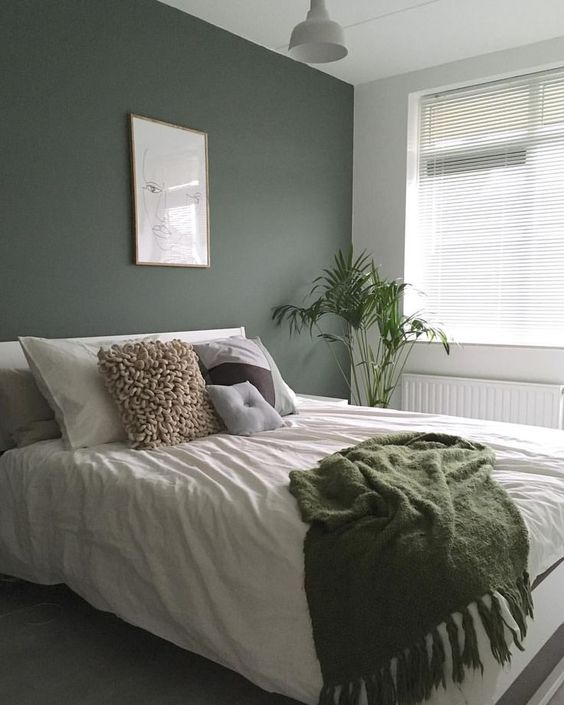 While softer, lighter greens allow the light to fill and expand the space. 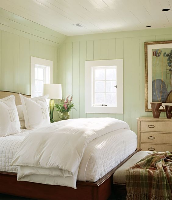 There are of course also rather vibrant greens available, those work very well too. They still provide that lovely relaxing atmosphere yet with a little more fun and funk thrown in there. 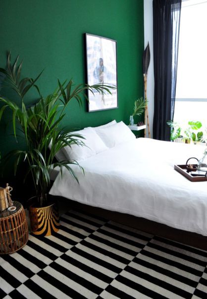 And now for those brave enough. Going all green! Even with a dark shade like this, on all walls and the ceiling you still keep that lovely welcoming feeling you just can’t wait to retreat to after a long day. 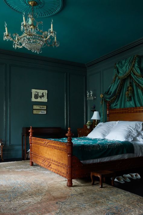 Overall green works very well in a bedroom. It brings the right amount of colour to brighten the space and give it an interesting feeling while not being over stimulus, allowing you to come to rest.
|
AnneriekeInterior tips and tricks. Archives
August 2020
Categories |
 RSS Feed
