|
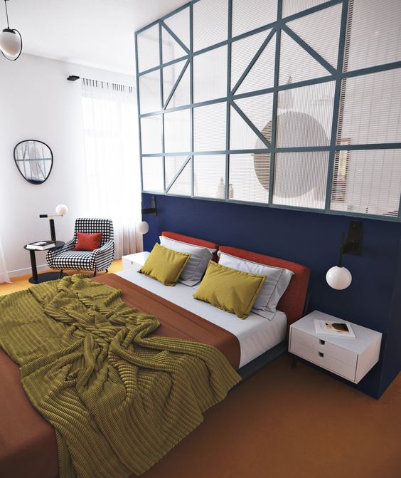
Coral can be quite a tricky colour to match to your interior as it really stands on its own. However it is not impossible. If you have a piece of furniture in coral you might be looking to highlight it in someway, and why not?! So how to go about this. Placing a white or off-white wall behind the coral allows the colour to shine and be the center piece in the room. 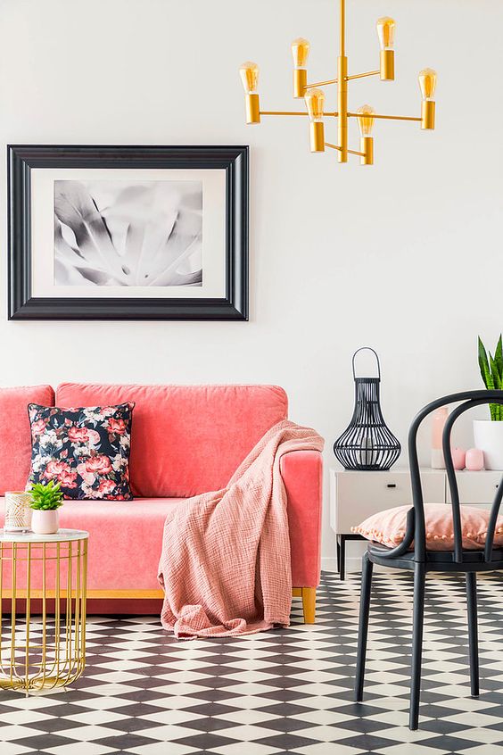 It frames the colour beautifully and supports its vibrant nature. It keeps the look fresh, new and crisp. Off-whites with a hint of grey or blue make sure the edges don’t blend and frame the furniture just right. While off-whites with a hint of yellow or pink blend in with the coral thus fading the edges between wall and furniture. 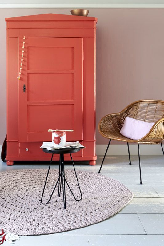 Pairing the coral with a darker back ground also gives an amazing effect. Rather that bringing the crispness out it surrounds the coral lovely. The dark walls hug the coral, highlighting the warmth of the colour, bringing out the coziness. 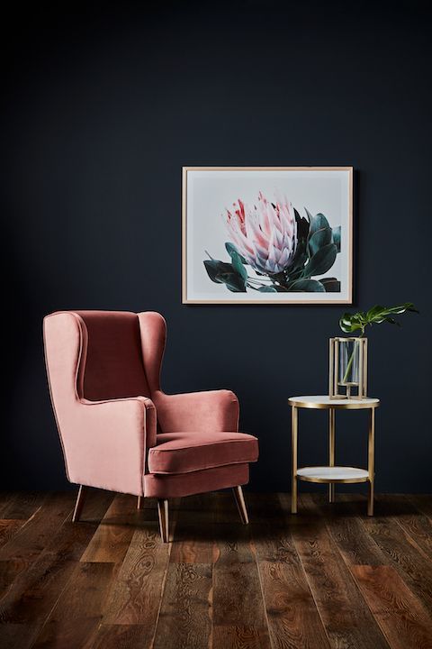 Think of dark blues, greens and greys. Again, these colours frame the coral without blending with the furniture, keeping the outlines clean. 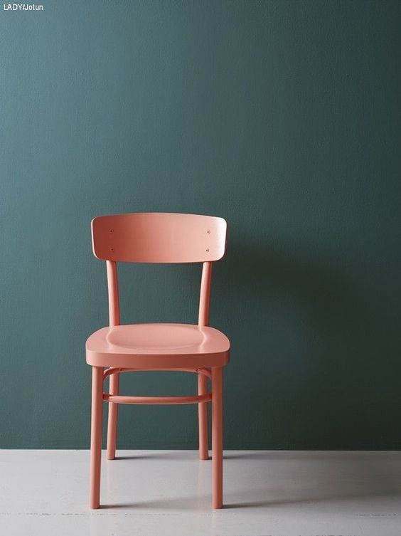 The same goes for accent walls. Using coral as an accent or feature 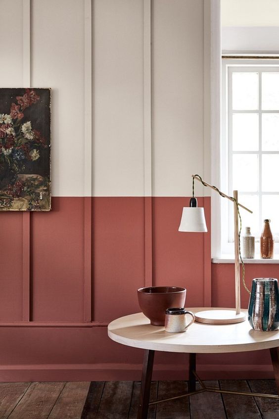 And pairing it with pastels, especially on walls, create a beautiful and versatile background. 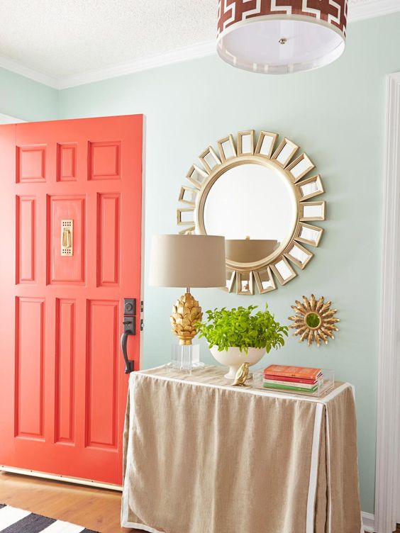 All images from Pinterest.com
0 Comments
Grey is very much a neutral colour, which is great as it opens up pretty much endless possibilities for accents colours, textures, patterns and other furnishings. When starting with grey as your base colour think of where you would like the final look to go as this will influence the further colour choices you make. For a calming, neutral finished look add colours of the same value yet different tones. Sticking to other neutrals will create a cohesive, relaxing environment. Think of other greys, browns, off-whites, beiges, etc. Adding some natural elements like a wooden coffee table of shelves will look amazing in a space like this. Though mixing different colours would be advisable as keeping all elements in the room grey can make the space look quite bland, adding other neutrals bring life and depth to the space. 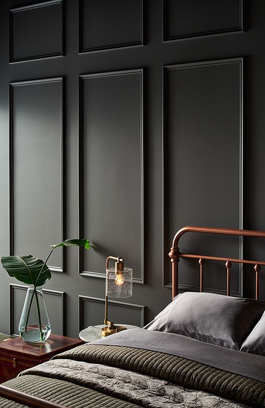 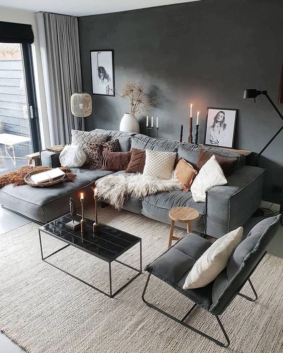 That said. Grey as a base also allows you to go bold and choose vibrant, popping colours to add a funky, interesting and playful edge to an interior. Think of dark grey walls with a big neon art piece. Grey walls and floors with a bright orange accent chair. Neon signage, lime green rugs, pink velvet sofas. The possibilities are endless and so fun when taking a little leap and going for that unexpected item. Grey can give a very sophisticated look, which makes it all the more fun to break that up with something unexpected. Keep that sophisticated look but add funk, add fun, add that unexpected edge and let it shine! 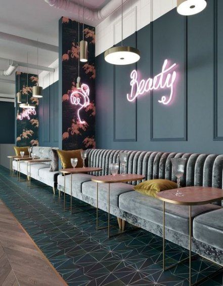 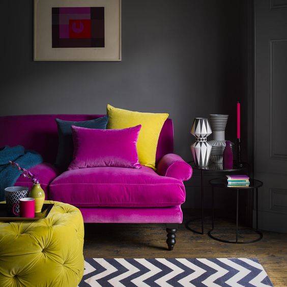 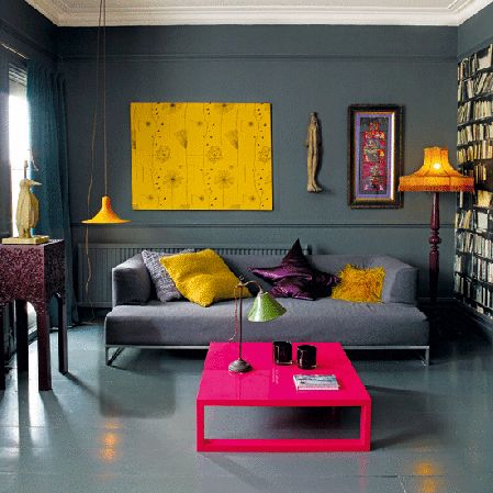 Grey gives you an incredible chance to go bold, to try something new and unexpected. Go for it! All images from Pinterest.com
In general the bedroom in the room in the house you want to go to to relax and get a good night sleep. Calming colours, like green, therefore work very well in such spaces. Although green is categorized as a ‘cool’ colour choosing the right shade of green can certainly add a warm sense as well. Depending on the mood you are ultimately trying to set in the bedroom there are several ideas available. If you are looking to add a little zest and fun to the space then choosing a bright, perhaps neon, shade might be the way to go. Its fresh, paired with the correct accessories it can be a quite clean and fun space. 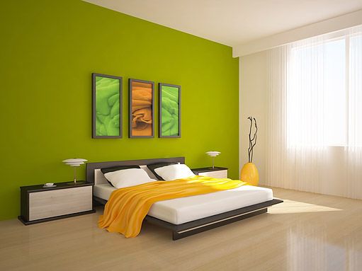 If it’s a more tones down, calming, zen kind of vibe you’d prefer then look at sage, moss, darker shades, green with a grey undertone. It provides the calming, comfortable feel and looks great. 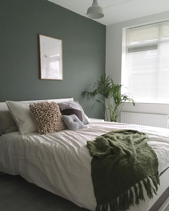 While softer, lighter greens allow the light to fill and expand the space. 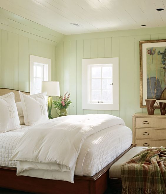 There are of course also rather vibrant greens available, those work very well too. They still provide that lovely relaxing atmosphere yet with a little more fun and funk thrown in there. 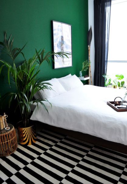 And now for those brave enough. Going all green! Even with a dark shade like this, on all walls and the ceiling you still keep that lovely welcoming feeling you just can’t wait to retreat to after a long day. 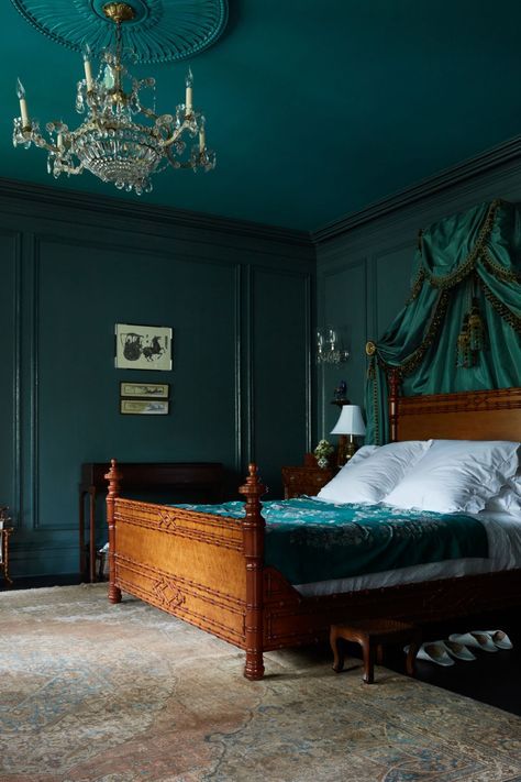 Overall green works very well in a bedroom. It brings the right amount of colour to brighten the space and give it an interesting feeling while not being over stimulus, allowing you to come to rest.
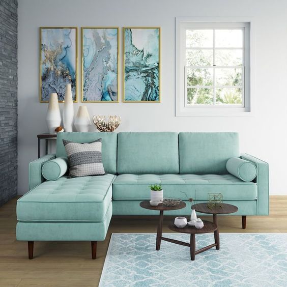
The items you already have in the space are a great starting point. The dark grey sofa opens a lot of options to create an interesting and comfortable space. That with the glass and wood dining table keep the main furniture quite neutral. That said, what material or colour are the dining chairs? First I would look at the space itself. Are you looking to keep it one space? or would you like to zone the living room from the dining room? This can be easily and effectively done with wall or floor coverings so don’t worry! Now, let’s dive into the colour palette. Something stylish, versatile and feminine. Pink is the easy answer here, however it is definitely not the only option. Pink with grey does pair very well and choosing the right pink/grey combination can definitely make for an interesting space. 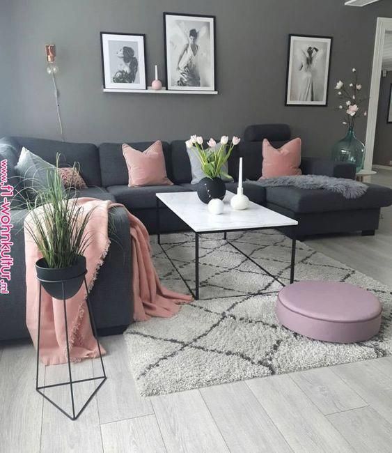 Keeping the wall light (like the image below) will make it easy to change thing around quickly and effectively when you are looking to freshen up the space. That with the black detail adds a very stylish and timeless look. 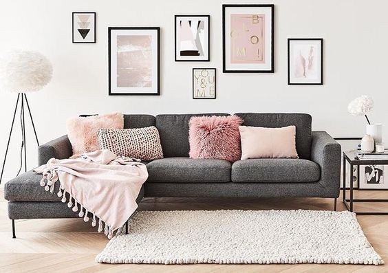 Another option is going for off whites complemented with teals, duck egg, fresh greens, purples. All will work well in both living room and dining room settings.   It is not just the colour palette that makes the room stylish or feminine. Look at the patterns and textures you add to the space as well. This can be added through a rug, furniture, cushions etc. However it can also be incorporated in the wall covering, by adding wallpaper, a mural or art pieces. 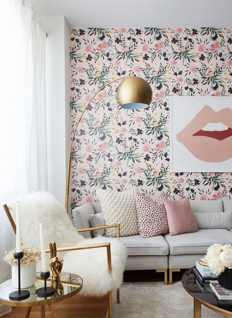  All these little elements not only make the space stylish feminine. It also makes it unique and yours.
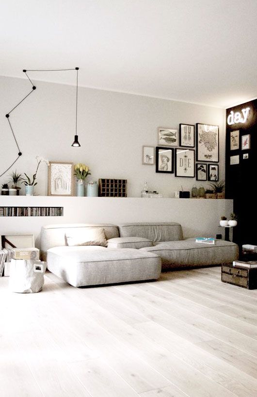
Choosing grey as the main or base colour of your decor opens up a great number of options as to adding interest. Depending on the type of grey you have chosen you can add pretty much any colour depending on the look you are looking for. If you have a light grey and are trying to add interest or depth to the rooms look at adding darker, vivid colours and warm wood tones (walnut, dark oak). these will really jump out and create a lovely contrast to the calming grey background. 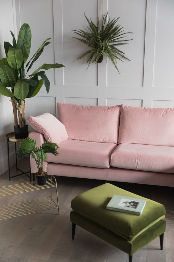 If you prefer to keep the space calm and light, having white trim, light wood tones (beech) and various tones of grey, whites etc will still add interest yet in a more subtle, calm way.  Having chosen a mid grey still allows a lot of options. Again, setting it against bold colours adds drama, interest and depth. It is a great start to add a little industrial style. Pair with dark grey or black trim and wood or metal elements creates a unique and texture rich space. Throw a bright painting or neon light on the wall and it transforms into a funky, unexpected space. The mid grey adds warmth to the space where the light grey does less so. This gives a great starting point to make a lovely cozy space. Building on this with a dark blue accent wall for instance adds interest. 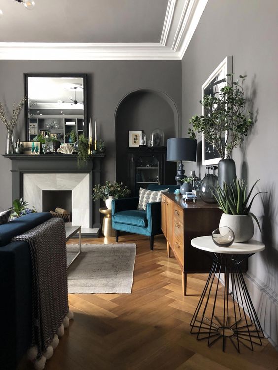 Darker greens and blues pair well with mid grey and can build on the calmer yet interesting feel. While yellows and oranges jump out, freshening up the space, adding energy to the space. 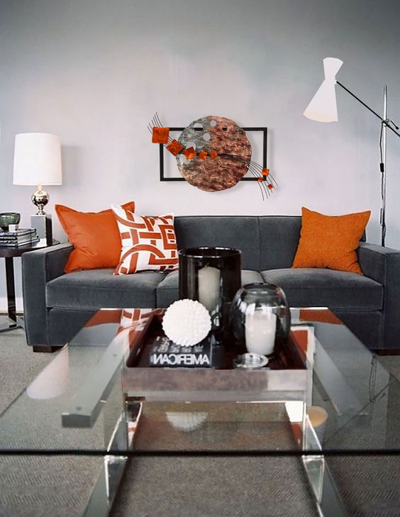 If a dark grey is the colour you have chosen think about where you would like to go from there. Lighten up the space by adding lighter tones and colours to bring a little perspective into the space. Or, again, layer in darker, muted shades, wrapping the space around you. Making it cozy, warm and snug. Adding interesting lighting to a dark grey room can introduce amazing effects. Pair it with rich purples, turquoise and deep greens transform the space into a stately yet comfortable living space. Add textures and patterns for comfort and perspective. Lighter furniture or a dark sofa will both work. 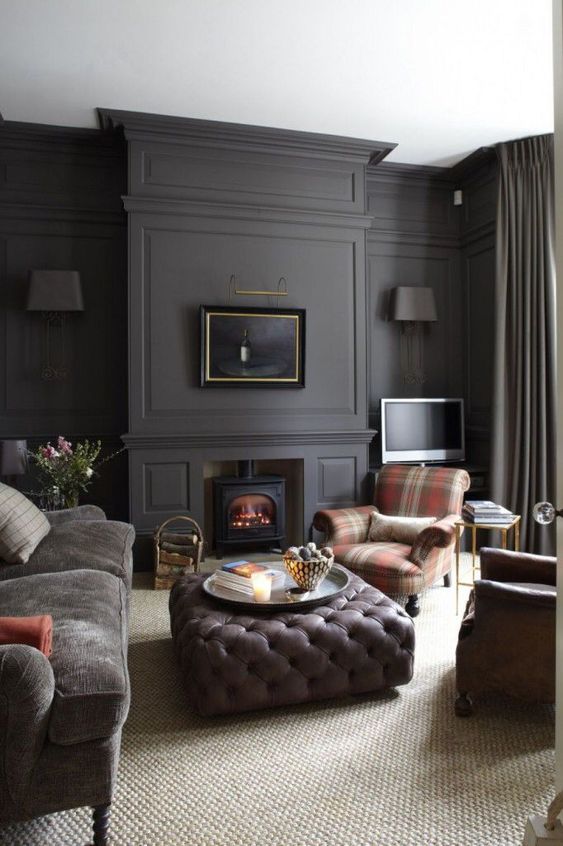 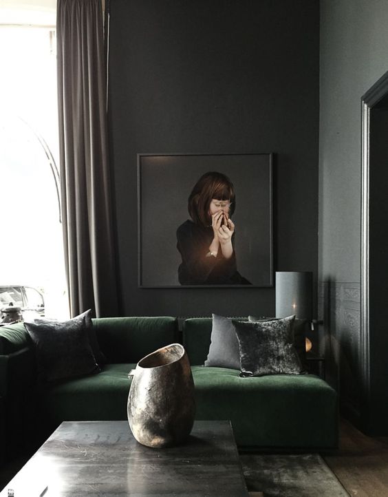 With grey there are a million and one options to explore. Have a think of where you would like the feel of the space to go and build towards that. All images from Pinterest.com
With so many types and styles of sofas to choose from, what make someone choose one over another?6/9/2019 In the end it doesn’t really matter why someone else chooses one sofa over another. It only matters why you choose that particular sofa over another. Every household, place, business, etc that has sofas has a different checklist to which the sofa must fulfill. (or as close to it as possible) So before going out to shop for the new suite, make a list for yourself. They may only be guidelines, but are always handy to be able to refer back to as the whole process can be a little overwhelming. So here are a few guidelines to help in the process.
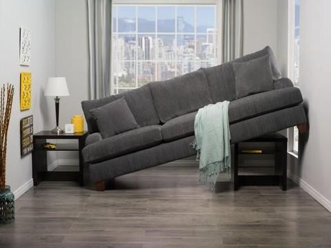 2. Material Who and what is going to be using the sofa? Choosing the right material is as important as choosing the correct size. Consider who will be using the sofa. While a crisp white fabric sofa may sound like a fantastic option it may not be the ideal choice when you have kids, pets, dirty boots, etc running around in the living room. For the same reasons choosing leather or easy clean fabrics etc might be a better option. Every sofa has several options available, yes sometimes certain options will take longer to be delivered however it can be worth it to wait a few extra weeks and get exactly the sofa you had in mind.  3. Floor space While this may not be the most essential it is something to keep in mind, especially when dealing with limited floor space and/or small spaces. To make the room feel bigger choosing furniture, thus sofa’s, on higher legs allows more floor space to be visible, thus creating the illusion the space is bigger. It helps make the pieces themselves look ‘lighter’ and less ‘chunky’ creating a much more relaxed space.
4. Colour One of the most prominent elements of the sofa. Choosing the right colour can balance a room. Whether you prefer a patterned, light, dark or funky colours sofa is totally up to you, but don’t be afraid to be a little bold! There are some amazing pieces out at the moment in bright, rich velvet. You can choose to just have a sofa, or choose to add a comfortable statement piece! It is up to you!  Take all points into consideration and have fun shopping for the perfect piece! All images from Pinterest.com
When it comes to keeping an office organized it comes down to a good structure. Storage is perhaps the main thing to keeping a space looking tidy. Whether you prefer open storage ie shelving or open cabinets, or prefer keeping things behind doors you will still need to come up with a system within the storage to help things stay tidy. Rather than putting everything in a cabinet and quickly closing the door doesn’t always solve the solution. Yes everything it tucked away, however knowing that things you can no longer see are also organized will add that extra piece of mind, creating a calmer mind, thus an organized and more enjoyable work environment. Keeping all the paper items in one drawer. Organizing all the stationary in another (perhaps using a cutlery tray), lining up all books, folders, binders, etc on a shelf. are just a few ways of making the office a tidier and easier place to work in. Giving everything its own place and returning things to those spots after using are a simple way to organize and keep it organized in the long run. When this is sorted look at the little things. Tucking all leads, (whether its the computer cords, lamps, radio, etc) out of sight. It seems like a little detail, however things like this look very untidy and often go unnoticed. Simply by hiding them keeps them out of sight and out of mind. Have a look at these images, perhaps they bring a little inspiration. 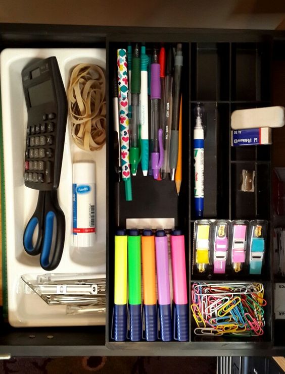 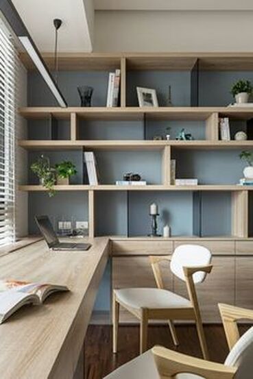 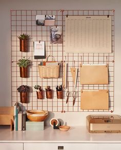 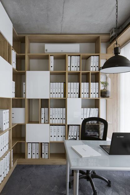 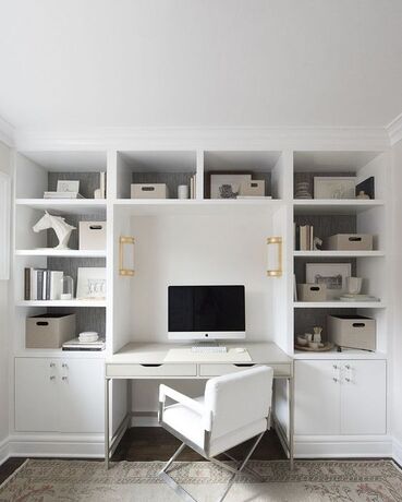 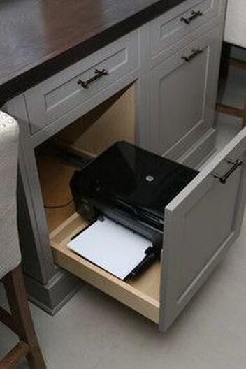 All images from Pinterest.com
This is quite an interesting combination of styles for one space. However there is a certain overlap of elements between the three styles that can form an interesting and unique space. The trick here will be to find the right balance. Therefor let’s look at some examples of each individual style first. (bare in mind this is just a selection of each style)  Vintage/Retro style 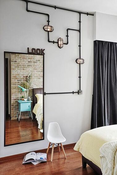 Industrial style  Modern style I would take some stand out elements of each style and combine those. For instance.
To finish it off use the exposed pipes, industrial lighting, metal elements of the industrial style to bring the whole to life. Be subtle, make sure you don’t over do any of the styles, but blend them together. pick a metal lampshade that perhaps has a hint of retro in it, like the colour of the piece or perhaps a decorative curve. Add a rug which doesn’t have big bold patterns, but perhaps rather a subtle geometric pattern. It’s all about balance and detail to bring these three styles together. Have a look at some inspiration images below where styles a fused together.
 All images from Pinterest.com
A minimalist interior is all about finding the balance between having the bare, yet essential, elements without the room look and feeling empty or cold. Colour will have a huge impact in this. Finding that balance in minimalism is creating a space that is functional and comfortable for you and yet where nothing really stands out. Whites, neutral and pale shades of colours (to add that little bit of interest) are the way to go for this. Pick a few colours that work for you and add interest by layering these colours in different textures and shades. Nothing vivid or outrageous, but rather calm, neutral, bare. Layering whites with greys and adding a little natural wood for a warm touch can create a clean yet comfortable background for your minimalist look. In picture 4 (below) they added just a hint of pink for a little colour. Doesn’t take away from the rest of the room yet still adds that little bit of coziness. Below are a few inspirational pictures to have a look at. Enjoy!   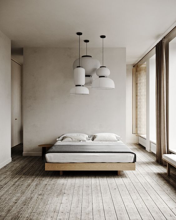 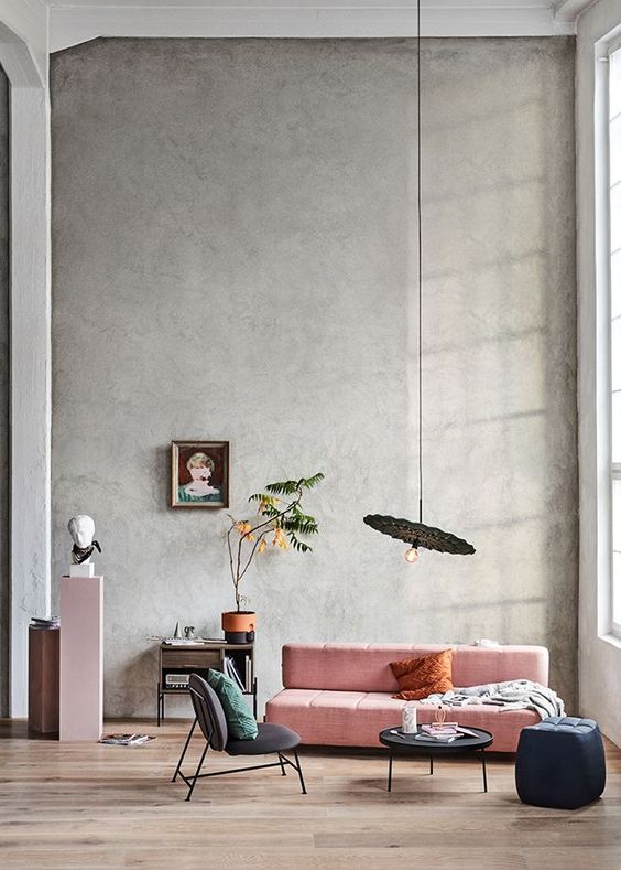  All images from Pinterest.com
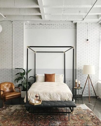
Combining brown furniture is a case of finding the right balance. Pairing the furniture with light, off-white and such, colours can create a lovely light atmosphere. While combining it with darker shades of blue and green can evoke an amazing cozy feel. However I would stay away from combining it with beige, creams, yellows and such. Especially if the furniture is a quite dark brown this can enhance a ‘heavy’ feeling in the room, and can often make it look dated, tired and bland. I will show a few examples below of different combinations for inspiration. Paired with light walls:   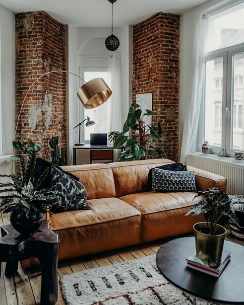 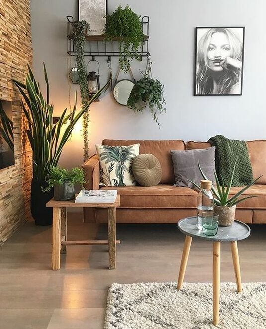 Paired with dark walls: 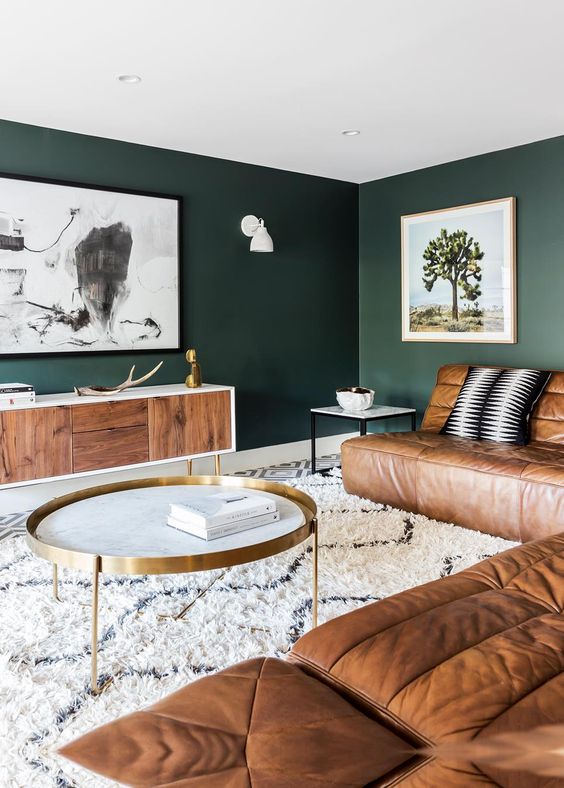 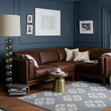 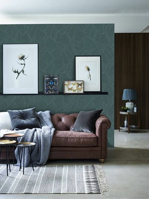 Paired with beige, creams, browns: 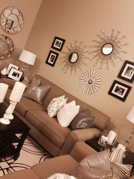   Try to combine the furniture with colour, whether that is in the walls or perhaps a colourful rug. Brown does best when paired with different colours like greens, blues and grey’s. All images from Pinterest.com
|
AnneriekeInterior tips and tricks. Archives
August 2020
Categories |
 RSS Feed
